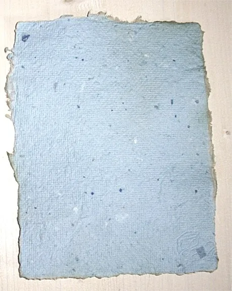
Feel First: Why the Surface of Your Paper Shapes Everything You Create

Photo: Kunal Nagar, CC BY-SA 4.0, via Wikimedia Commons
There is a moment every serious creative knows — the instant a nib, brush, or pencil meets a new sheet of paper and something either clicks or falls flat. The line flows or it catches. The ink blooms beautifully or bleeds without grace. That moment has almost nothing to do with how much the paper weighs.
And yet, when most people shop for premium paper, the first number they consult is the GSM — grams per square meter, the standard measure of paper weight. A higher GSM feels authoritative. It sounds scientific. It gives buyers confidence. But for those who create with genuine intention, weight is only the beginning of the conversation. Texture — the living, tactile personality of a sheet — is where the real story unfolds.
The Tyranny of the GSM Obsession
The fixation on paper weight is understandable. GSM is measurable, comparable, and easy to communicate across a product listing or a supply catalog. A 300 GSM sheet feels substantial in the hand. It resists buckling under wet media. It projects permanence. These are real virtues.
But weight tells you almost nothing about how a surface will behave when you actually work on it. Two sheets of identical GSM can perform in entirely opposite ways depending on their finish, their fiber composition, and the degree of surface sizing they have received. A 300 GSM hot-press watercolor paper and a 300 GSM cold-press sheet are worlds apart in use — not because one is heavier, but because their surfaces present completely different creative environments.
For a calligrapher, a smooth, slightly sized surface allows the nib to glide with precision, creating hairline strokes that feel almost effortless. For a watercolorist, that same smoothness may be a liability — pigment pools rather than settles, and the expressive granulation that gives a painting its character simply cannot occur. Neither surface is superior in the abstract. What matters is the relationship between the texture and the intention behind the work.
Understanding Tooth: The Hidden Architecture of Paper
Paper artists and illustrators speak frequently of a paper's "tooth" — the microscopic roughness of the surface that catches and holds dry media like graphite, charcoal, and pastel. A sheet with significant tooth has a textured weave or grain that creates friction, allowing pigment particles to embed in the surface rather than sit precariously on top of it.
This matters profoundly for fine artists working in layered techniques. Pastel artists, for instance, depend on tooth to build multiple applications of color without the surface becoming saturated and unworkable. The first stroke deposits pigment in the peaks of the texture; subsequent layers reach into the valleys. The result is depth that a smooth surface simply cannot support.
For graphite illustrators, the relationship is more nuanced. A fine-tooth surface allows for precise detail work and smooth gradations, while a more pronounced tooth breaks up the mark and lends a more expressive, gestural quality to the line. Neither is wrong — but choosing the wrong tooth for your intended technique can make even exceptional skill feel constrained.
Finish as Intention: Hot Press, Cold Press, and the Spaces Between
The paper industry has traditionally organized surface character into broad categories — hot press (smooth), cold press (moderately textured), and rough (heavily textured). These designations offer a useful framework, but artisanal and specialty papers frequently exist in the spaces between these categories, offering surfaces that defy easy classification.
Hot-press papers, produced by passing the dried sheet through heated rollers, achieve a hard, smooth finish ideal for pen and ink, technical illustration, and certain printmaking applications. The controlled surface rewards precision and rewards the kind of deliberate mark-making that defines professional design work.
Cold-press papers, dried without the compressive heat treatment, retain more of the natural fiber texture. This is the workhorse surface for watercolor and mixed media — textured enough to hold washes and encourage granulation, but not so rough as to interrupt fine detail work. The subtle irregularities in a quality cold-press sheet are not flaws; they are the evidence of craft.
Rough-surface papers, often associated with traditional European and Japanese papermaking traditions, carry pronounced texture that actively participates in the creative process. A brushstroke across a rough sheet breaks and skips in ways that cannot be precisely controlled — and for many artists, that loss of total control is precisely the point. The paper becomes a collaborator rather than a passive substrate.
How Texture Creates Memorability
Beyond technique, there is a psychological dimension to paper texture that is rarely discussed but deeply felt. A letter written on a textured, laid paper carries a different emotional register than the same words printed on smooth copy stock. The reader's fingertips register the surface before the eyes have finished reading. The tactile experience primes an emotional response — a sense of care, of deliberateness, of something made rather than produced.
For designers creating physical collateral — invitations, packaging, editorial pieces, artist books — texture is a design element as intentional as color or typography. A matte, slightly rough cover stock communicates understated confidence. A highly calendered, smooth sheet signals precision and modernity. These are not accidental associations; they are the accumulated result of centuries of human hands touching paper and drawing meaning from what they feel.
Calligraphers understand this intuitively. The finest script, rendered on a paper with the right surface character, becomes something a recipient wants to keep. The combination of the artist's skill and the paper's personality creates an object that transcends its function. It becomes memorable — which is, ultimately, the aspiration behind all intentional creative work.
Choosing Texture with Intention
If you are ready to move beyond weight as your primary selection criterion, the most valuable thing you can do is sample broadly and work deliberately. Request swatches or sample packs from specialty suppliers. Apply your actual tools — your specific nibs, your preferred brushes, your habitual pencils — to unfamiliar surfaces and observe how the relationship changes.
Pay attention to how ink dries, how pencil erases, how the surface responds to moisture. Notice whether the texture encourages the kind of marks you want to make or resists them. Over time, you will develop a working vocabulary of surfaces that match your methods — and that vocabulary will become one of the most sophisticated tools in your creative practice.
Paper weight will always matter. A flimsy sheet cannot support serious work. But weight is the floor, not the ceiling. Texture is where creative decisions live — where the difference between adequate and extraordinary is made, one carefully chosen sheet at a time.