When the Screen Lies: How Printing Your Digital Work Reveals What Pixels Conceal

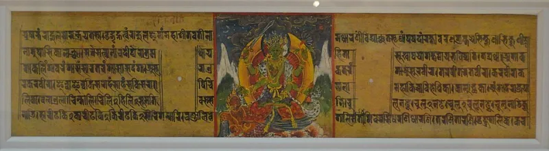
Photo: Smithsonian Institution from United States, No restrictions, via Wikimedia Commons
There is a moment that many designers know intimately, even if they rarely speak about it: the quiet unease that lingers after a project is submitted—the nagging suspicion that something was slightly off, something the screen never quite showed them. For a growing number of creatives across the United States, the antidote to that uncertainty is decidedly low-tech. They print.
Not for archiving. Not for client presentations. They print specifically to look—to hold their digital work in their hands and let paper do what screens cannot: tell the whole truth.
The Limits of the Luminous Rectangle
Every screen emits light. It is, at its core, a source of illumination, and that illumination is extraordinarily flattering. Contrast appears sharper than it is. Colors glow with a vibrancy that ink on paper will never replicate without careful calibration. Subtle misalignments in layout are softened by the continuous refresh of pixels. The human eye, conditioned over years of screen interaction, has learned to forgive a great deal.
Paper forgives nothing.
When a design is committed to a physical surface—particularly a premium sheet with a consistent, calibrated finish—every decision made in the digital environment is exposed with unambiguous clarity. A typeface that read beautifully at 72 DPI on a backlit monitor may reveal awkward letter spacing when printed at true scale. A photograph that appeared richly saturated on screen may print with a muddy midrange that only becomes visible under natural light. A layout that seemed balanced on a 27-inch display may feel visually weighted to one side when experienced as a physical object held in the hand.
These are not failures of the printer or the paper. They are revelations.
What Creatives Are Actually Discovering
Graphic designers who have incorporated regular print proofing into their process report a consistent pattern: the first proof almost always surfaces at least one element they want to revise. Typography is the most frequent offender. Leading that appears generous on screen often reads as cramped in print. Headline weights that dominate a digital composition can appear timid when stripped of backlighting.
For editorial designers working on book interiors, magazine layouts, and long-form publications, the print proof has become an indispensable editorial tool. Reading a manuscript on screen engages a different mode of cognition than reading it on paper. The physical act of turning pages, of running a finger beneath a line of text, activates a slower, more deliberate attention. Errors that survive multiple screen-based proofreads frequently surface within the first few minutes of reading a printed proof.
Visual artists producing work intended for physical reproduction—fine art prints, greeting cards, stationery, limited-edition posters—face perhaps the most consequential gap between screen and sheet. Color management is a discipline unto itself, and even experienced practitioners acknowledge that no monitor profile, however carefully calibrated, fully predicts how ink will behave on a specific paper stock. The texture of the surface, its optical brightness, its coating or lack thereof—all of these variables interact with pigment in ways that only a physical proof can reveal.
The Paper Choice Is Part of the Process
Not all print proofs are created equal, and experienced creatives are increasingly deliberate about the paper they use for this stage of their workflow. Proofing on a generic copy sheet tells you relatively little about how a project will ultimately perform on a textured cotton stock or a smooth, heavyweight art paper. The most instructive proofs are printed on surfaces that closely approximate the final substrate—or, where exact matching is impractical, on a sheet whose characteristics are well understood and consistent.
This is where the quality of the paper itself becomes a creative instrument rather than merely a logistical variable. A sheet with consistent opacity, accurate color rendering, and a surface that holds fine detail without bleeding will produce a proof that genuinely informs decision-making. A cheaper, inconsistent stock introduces noise into the process—it becomes difficult to determine whether a flaw belongs to the design or the paper.
Many designers maintain a small, curated selection of proofing papers specifically chosen for their reliability and their ability to render color and detail accurately. These are not necessarily the most expensive sheets available; they are the most consistent—papers whose behavior is predictable enough to serve as a trustworthy reference point.
Slowing Down to See More Clearly
There is a less quantifiable dimension to this practice that creatives return to again and again when describing its value: the act of printing forces a pause.
Digital work exists in a state of perpetual revisability. Every element can be adjusted, undone, and reconsidered in seconds. This flexibility is enormously powerful, but it also creates a kind of creative restlessness—a difficulty in truly seeing a composition as a finished thing, because it never quite feels finished. The option to change is always present, hovering just beneath the surface.
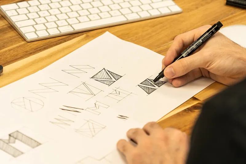
Printing a proof imposes a form of temporary finality. The design is committed to a surface. It becomes an object. And as an object, it demands a different quality of attention. Creatives describe stepping back from their desks, propping a proof against a wall, and looking at it the way a painter steps back from a canvas—with distance, with fresh eyes, with the particular clarity that physical presence provides.
This is not nostalgia for an analog era. It is a pragmatic acknowledgment that human perception operates differently when it engages with something tangible. The screen is a tool. The proof is a mirror.
Building the Habit
For creatives who have not yet formalized a print-proofing practice, the barrier to entry is lower than it might appear. A quality inkjet printer, a selection of reliable proofing papers, and a disciplined commitment to reviewing work before final submission represent a modest investment relative to the clarity they provide.
The more significant shift is attitudinal. Printing a proof means accepting that the screen's version of a design is a proposal, not a verdict. It means building time into a project schedule for a physical review. It means treating paper not as the output of a creative process but as an active participant in it.
For those who create with intention—who care about the difference between work that is merely completed and work that is genuinely resolved—this shift tends to feel less like an added step and more like a restoration. A return to the understanding that the most honest conversation a creator can have with their work happens not on a glowing screen, but on a sheet of paper held in their hands under ordinary light.
The screen shows you what you made. Paper shows you what it actually is.