Decode the Sheet: A Practical Guide to Matching Paper Specifications to Your Creative Work

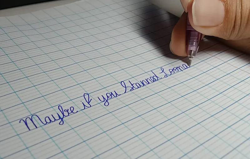
Photo: Raj Taneja from Bangkok, TH, CC BY-SA 2.0, via Wikimedia Commons
Walking into a well-stocked paper shop—or browsing the specifications of a premium paper supplier online—can be a quietly overwhelming experience. Terms like "hot press," "cold press," "25% cotton," "90 GSM," and "internal sizing" appear with little explanation, and the differences between them can seem abstract until you have experienced the wrong paper choice firsthand: ink that bleeds, watercolor that buckles, a letterpress impression that fails to hold.
Understanding paper is, at its core, understanding material. And for anyone who creates with intention—whether you are an illustrator, a calligrapher, a graphic designer, or a devoted letter writer—the right paper specification is not a minor detail. It is a foundational decision. What follows is a plain-language guide to the variables that define premium paper, along with discipline-specific recommendations to help you find the sheet that will serve your work most faithfully.
The Foundation: Fiber Content and What It Means for Your Work
All paper begins with fiber, and the source of that fiber shapes everything that follows.
Wood-pulp paper is the most common and least expensive variety. It is manufactured from processed wood cellulose and is perfectly adequate for everyday printing and general use. However, wood-pulp paper contains lignin, a compound that causes yellowing and brittleness over time when exposed to light and air. For archival purposes or work intended to last, this is a significant limitation.
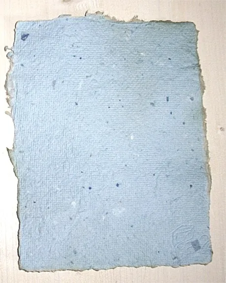
Cotton-content paper—sometimes labeled as "rag paper"—is produced from cotton linters or recycled cotton textiles. Cotton fiber is naturally acid-free, long-lasting, and exceptionally strong. A sheet of 100% cotton paper can endure for centuries without significant deterioration. It also accepts ink differently than wood-pulp paper: more cleanly, with greater definition, and with a surface that tends to feel distinctly more refined under the hand.
What this means for you:
- Illustrators and fine artists: Prioritize cotton-content or 100% rag paper for any work intended for exhibition, sale, or long-term preservation.
- Letter writers and correspondents: Cotton writing paper conveys a quality that recipients notice immediately. Even a 25% cotton blend elevates the experience considerably over standard office stock.
- Graphic designers and print professionals: For client-facing proofs or presentation documents, cotton-content paper communicates a level of craft that standard digital printing stock cannot match.
- Journalists and daily journal writers: A quality wood-pulp paper with acid-free certification is a practical and cost-effective choice for high-volume everyday writing.
Weight: Understanding GSM and Why It Matters
Paper weight is measured in grams per square meter, universally abbreviated as GSM (or g/m²). In the United States, you will also encounter the older "lb" designation—a somewhat confusing system that varies depending on paper type. For simplicity and consistency, GSM is the more reliable reference point.
Here is a practical breakdown of common GSM ranges and their typical applications:
| GSM Range | Common Use Cases |
|---|---|
| 60–80 GSM | Lightweight writing paper, airmail stationery, thin journals |
| 90–120 GSM | Premium writing and correspondence paper, everyday journaling |
| 130–170 GSM | Cardstock, heavy writing paper, mixed-media journals |
| 200–300 GSM | Watercolor paper, illustration board, art prints |
| 300+ GSM | Heavy watercolor paper, printmaking substrates, specialty art stock |
Decision guidance:
- If you are writing with a fountain pen and using wetter inks, a minimum of 90 GSM is advisable to prevent show-through and feathering.
- Watercolor practitioners should generally not work below 200 GSM; 300 GSM cold-press cotton paper is the most widely recommended starting point for wet-media work.
- For letterpress or relief printing, heavier papers (250 GSM and above) accept impression depth more cleanly and resist tearing under press pressure.
Sizing: The Hidden Variable
Sizing refers to a treatment applied to paper—either internally during manufacture or externally as a surface coating—that controls how the sheet absorbs liquid. It is one of the most consequential and least-discussed variables in paper selection.
Unsized (waterleaf) paper absorbs ink immediately and extensively, making it suitable for certain printmaking and blotting applications but poorly suited for writing or detailed illustration.
Internal sizing (typically achieved with rosin, starch, or synthetic agents added to the paper pulp) gives the sheet moderate absorbency and is standard in most premium writing papers. It allows ink to sit on or just below the surface, producing clean, sharp lines.
Surface sizing adds an additional treatment to the sheet's exterior, further reducing absorbency and increasing surface hardness. Papers with strong surface sizing are excellent for fine-line technical drawing, pen-and-ink illustration, and any application where precise ink control is essential.
What this means for you:
- Calligraphers: Look for well-sized paper specifically—unsized or lightly sized sheets cause ink to spread unpredictably, which undermines the precision that calligraphy demands.
- Watercolorists: Paradoxically, less sizing can allow for more expressive wet-on-wet techniques, while heavier sizing gives you more control over hard edges and fine detail.
- Fountain pen users: Surface-sized papers tend to produce the most satisfying writing experience, with minimal feathering and excellent line definition.
Finish: Hot Press, Cold Press, and Rough
For art papers in particular, finish is a defining characteristic that directly affects texture, mark-making, and the visual quality of the finished work.
Hot press paper has a smooth, hard surface produced by passing the sheet through heated rollers. It is ideal for fine-line work, technical illustration, pen-and-ink drawing, and any technique where surface texture would interfere with precision.
Cold press paper (also called "not" in British papermaking terminology, short for "not hot pressed") has a moderate texture—enough to add visual interest and hold paint effectively, but not so pronounced as to disrupt fine detail. It is the most versatile surface and the most widely recommended starting point for watercolor practitioners.
Rough paper is the most heavily textured option, produced with minimal pressing. It is favored for expressive, gestural watercolor work and for techniques that benefit from the visual effect of broken paint across a pronounced tooth.
Quick-reference finish guide:
- Pen-and-ink illustration: Hot press
- General watercolor work: Cold press
- Expressive or gestural watercolor: Rough
- Graphite drawing: Cold press or hot press, depending on whether texture is desired
- Letterpress printing: Uncoated, lightly textured sheets generally produce the most tactile impression
Putting It Together: A Simple Decision Framework
With these variables in mind, the process of selecting paper becomes considerably more navigable. Ask yourself four questions before committing to a sheet:
- How long does this work need to last? If archival permanence matters, prioritize cotton-content, acid-free paper regardless of other factors.
- What tools am I using? Wet tools (watercolor, ink washes, fountain pens with wet inks) require more careful attention to sizing and weight than dry tools.
- How much surface texture serves my technique? Match finish to the level of detail and expressiveness your work demands.
- What is the practical volume of my use? For high-frequency daily practice, a quality mid-range paper (90–120 GSM, acid-free, well-sized) offers an excellent balance of performance and economy. Reserve your finest cotton sheets for work that warrants them.
Paper selection, at its best, is an act of alignment between material and maker. When the specifications of a sheet are matched to the demands of a practice, the paper disappears into the work—and what remains is the clearest possible expression of the creative mind behind it.